Error Handling @ Google
Challenge: combined functionality = combined errors
Ads Creative Studio (ACS) was Google’s new advertising platform. It acted as a unified home that enabled creative users to build video, display, and audio ads in a single place. As a result, it consolidated features previously spread across different products.
However, it not only brought together all this great functionality, it also consolidated all error handling. So the errors previously spread across different products… are now smashed into one place. As a result, the current designs for showing errors (meant for one product) looked overwhelming when used in ACS.
Opportunity: new error handling designs needed support and guidance
To help troubleshoot this, an interaction designer created new error handling designs. Error handling, for reference, is how systems identify what error was made, where it is located, and how to fix it. The new designs were made to consolidate errors in a way that wasn’t overwhelming.
Please note that these designs are NDA-protected, so I don’t show any pictures of the current and proposed designs. Instead, this case study will focus on the approach to research and the impact afterwards.
Role: independently executed and managed the study
As a UX Researcher, I managed and led the study under the guidance of a senior UX Researcher. I scoped the research, shared the study with stakeholders, created the research plan and script, and implemented the study. My manager would be available to help and support me if I needed help, but I owned the project.
Research planning: scoped research from a design review
My UXR managers said that a good senior researcher keeps an ear out for future projects. By actively listening to stakeholder discussions, they can anticipate what topics will have higher priority and impact – and thus, senior UXR’s should be able to source projects that matter. My managers had heard about a new error handling design that was coming down the pipeline. So, they told me that this would likely be my project and to create my own study.
When the designer introduced the new error handling designs as part of a weekly design review, I took careful notes of what was important to all stakeholders: the engineers, product managers, senior designers, and UX researchers. After compiling their questions, comments, and concerns – I grouped them by similarity, ranked them by how often those questions came up, prioritized them by how often those questions came up. This created the foundation for my research plan and the research questions.
Research goal: learn users’ workflow & tailor designs accordingly
Learn how users handle errors
Gauge how current designs matches user workflow & get feedback
Methods: semi-structured interviews & usability/concept test
Semi-structured interview
For the first portion of the study, I chose to conduct a semi-structured interview to understand participant background and product expectations. ACS hadn’t launched at the time, so my team was still conducting foundational research to further understand the roles of each user profile. There hadn’t been any research conducted on who exactly was involved in error handling or what the current process looked like.
I wanted to be able to guide users through a series of questions about their current role and processes. However, I also wanted to be flexible and adapt if the participant shed light on a perspective or scenario that I didn’t know about. This was especially important since the team was still learning about these processes. I didn’t want to pigeonhole myself into something before I really truly understood the situation.
Walkthrough the mocks (not quite usability testing, but not exactly concept testing either)
Designers were mainly focused on the error handling’s tactical feedback. Since ACS had not launched (and engineers were still building the product), this was a completely new platform that participants hadn’t seen before. As such, we didn’t know what users needed from a consolidated platform.
To understand their workflow when tackling different types of errors across different stages, we needed to conduct a usability test and gauge how certain design elements functioned. We had static design mocks drawn up for this purpose.
Since the designer wasn’t sure which combination of design elements functioned the best, we implemented a concept test. There were 4 variations anticipated, but since multiple variations had overlapping elements (e.g. variant 1 & 2 had XXX design element, variant 3 & 4 had YYYY design element) – it wasn’t a clear cut experiment. We still moved forward with the concept test, but I would focus on the specific design elements across variants (instead of declaring a specific design variant as the winner).
Data analysis – affinity mapping
Although I take thorough notes during the session, I prefer to review the recording to make sure I didn’t miss anything. During this time, I start to compile my raw notes with powerful quotes, pain points and feature requests, and design feedback. I’ll write everything because I don’t know what is a trend or a theme until I get more participants.
Once I have all of my raw notes, I’ll use affinity mapping to group similar themes together. (E.g. These are all the pain points – within those pain points, these two tend to come up – those were driven by XYZ → overall need/solution is XYZ.) After I’ve gathered the themes, I’ll determine the severity based on how many times something came up and how important it is to the participants. (The importance is determined from participant feedback. I’ve learned to always ask the participants and dig deeper: why is this important? How does this affect you? How often do you come across this? My manager mentioned that if I’m advocating for something new, I’ll need concrete proof to back it up.)
Impact: informed future designs + generated engineering buy-in and support to leadership
Informed future designs
Detailed findings are NDA-protected, so I won’t list specific insights. Instead, I’ll share my general approach and why it’s important.
When sharing design insights, I prefer to show information top-down (where I start with bigger concepts before diving into the details).
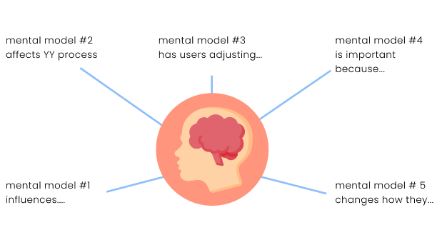
From the tactical findings, I created mental models for error handling. For instance, participants wanted to see errors ASAP and avoid a large list of accumulated errors. These mental models shed light on user behavior, enabling the design and engineering team to tailor the platform notifications accordingly. This helped us ensure that ACS would fit more seamlessly into their workflow.
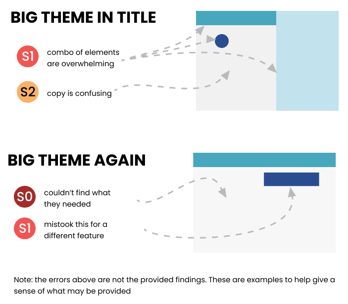
Towards the end of my presentation, I shared the more detailed tactical feedback. I compile my issues into themes during the data analysis. When putting together the presentation, I take screenshots of the product or the recording to show where the issues exist. This provides them with examples for them to refer to and get a better understanding of what participants struggled with. I try to include this when compiling tactical feedback, since designers care deeply about addressing issues. Also, its dedicated section means designers can skip directly to the end for future reference. E.g. designers and engineers are anticipated to review this post-launch, so having everything in one place and with pictures means they remember this information a few months (or even a year) later.
Generated engineering buy-in & leadership support for design overhaul
Before the study kicked off, there were initial pushback from engineers on changing error handling. First, the platform was an engineering Frankenstein, so certain elements were built from other teams’ code and it was difficult to add/remove. Second, these were not consistent with Google Ads design guidelines, which was meant to give all Google Ads products the same feel. So changing it in one ad product meant changing it across all ad products. This needed leadership approval before engineers could work on this.
To help overcome that, I emphasized with engineers to step in their shoes. I know they’re busy working on building out the product and there’s a tight deadline. These error-handling designs won’t be considered until post-launch, so it’s for later stages. The main goal is to save them time later on. To ask that they make sure the code is flexible for potential later on. This research is only meant to determine whether or not these changes are even needed. Also, the designer will be handling leadership persuasion. They won’t be asked to build this unless it’s approved.
The results from the study showed that current designs were overwhelming and not helpful. The engineers agreed with us to revisit this post-launch. The study would also be used to support design changes toward leadership. Since Google has a consistent design guideline across all advertising products, making this change for ACS would require changing it for all of Google Ads. So, these insights would go on to advocate for these design changes.