First-time Users @ Covid Watch
Challenge: a new app comes to campus
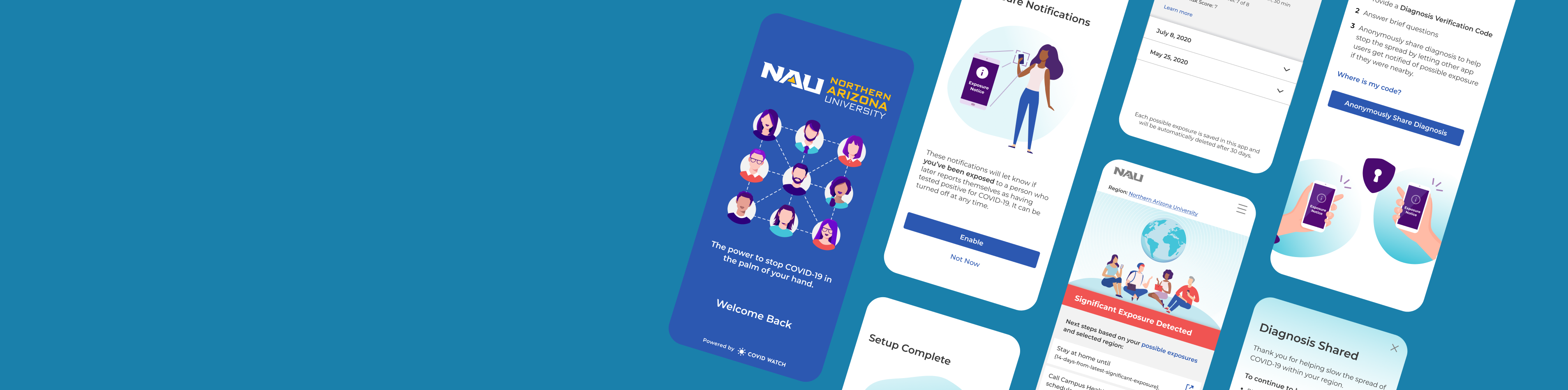
Covid Watch was a nonprofit exposure notification app testing in Bermuda and Arizona universities. Their goal was to slow the spread of COVID-19 by empowering users to anonymously share a positive diagnosis with their community. They launched the “Covid Watch Arizona” app in August 2020, making it available in time for students, faculty, and staff returning to campus.
We collaborated with a university pilot partner, the Northern Arizona University (NAU), to gauge first-time users’ experiences with the app.
Reminder: an exposure notification app was incredibly cutting edge at the time. Anybody looking for exposure notifications needed to install a dedicated app provided by their state’s public health authority. But only 6 states launched their own apps in Sep 2020, with many other states in the testing phase. The release of the Google and Apple ‘Exposure Notification Express’ made it possible for anybody to receive exposure notifications without downloading an app. Thus, making exposure notifications prevalent today.
Role: executing and managing the study
I managed and executed the study from scoping the project, recruiting participants, generating the discussion guide, workshopping the analysis, and reporting results back to the leadership team.
As the lead for the study, I collaborated with the NAU design team to generate buy-in for the study parameters and recruiting resources. I also coordinated efforts to train and manage the Covid Watch UXR team members. As a volunteer-led organization, these projects were meant to not only better the product, but also foster learning opportunities for everyone involved. This meant a majority of the team members didn’t have experience moderating a usability study (much less remotely). So, I created the discussion guide and offered training sessions to prepare them ahead of time.
Research question: what is the first-time user experience of the Covid Watch mobile app?
Do users understand how the app works and why using the app is important?
What are their privacy concerns? Have those been addressed within the app?
Do they trust the app and the entities providing the app?
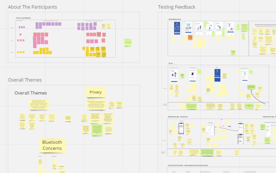
Moderated Usability Study – 3 key questions at 3 sections
Please note: the images shown are not NDA-protected. They are public facing and accessible via the Wehealth apps.
Onboarding: do users understand the app, and how it protects privacy?
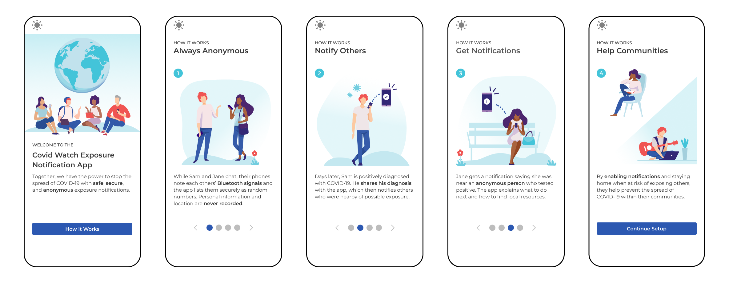
Since Covid Watch was introduced in 2020, this was the public’s first introduction to exposure notifications. So, it was important for ensure that first-time users understood how the app works. We were not testing their engineering knowledge, but trying to gauge if users understood that the app is completely private and anonymous. These images were also used throughout our marketing, so it would also help us gauge how informative these 4 designs were.
Setup: what types of information do they expect to provide? Why do they think we ask for it?
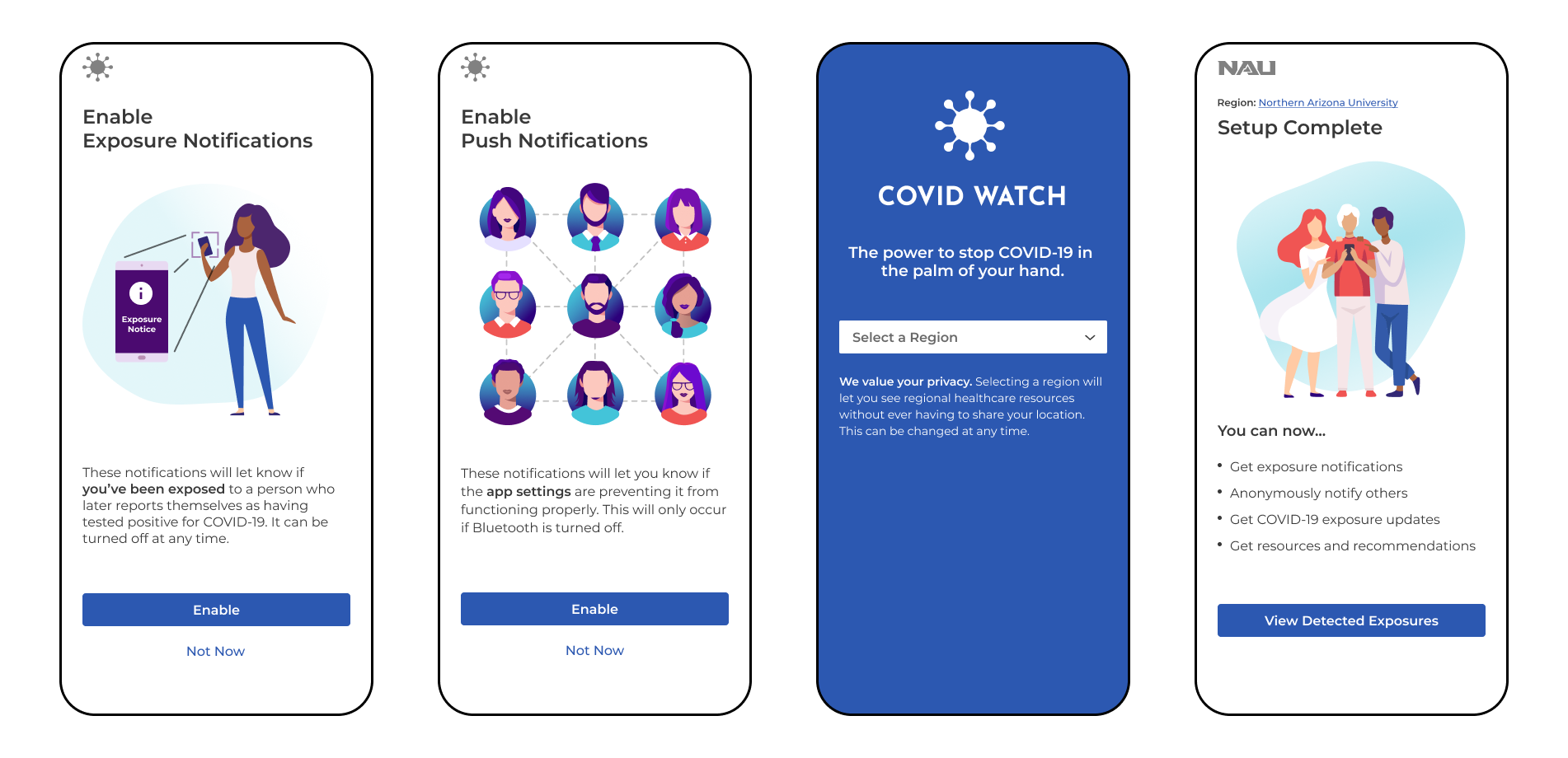
Although we ask their take on how private and anonymous the app was earlier, we ask what information they think they’ll need to provide throughout these steps. (Fun fact, we’ve had wild answers like Social Security Number and addresses). At the “Setup Complete” page, we ask again to gauge they felt about their privacy now.
Exploring the app: What information did they expect to see? Can the answers they need?
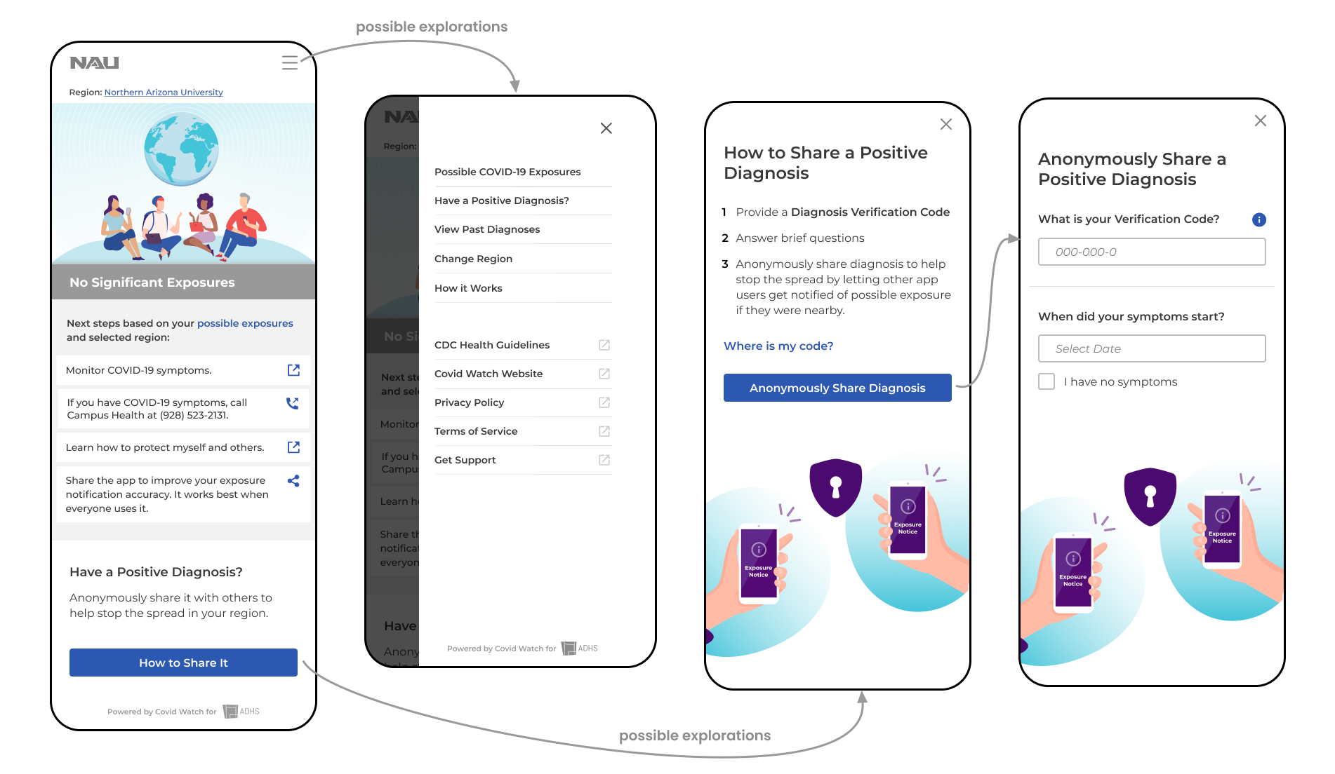
Before reaching this stage, we ask what questions they may have from onboarding and what they expected to see from the app.
Once they reach the homepage, we ask them for first impressions. E.g. What information was important to them? How does the information provided here compare to their expectations? After we let them explore and browse the app, we ask overall questions around the experiences. At the end, we remind them of the questions they had during onboarding and task them to find the answers within the app. The combination of these questions helped us loosely understand what information is important for them. (Keep in mind, we did not set out to research information hierarchy, which requires a card sorting exercise. This was meant to get a general understanding.)
Data analysis: affinity mapping on Miro
Although I typically work independently to conduct my analysis, this project was meant to act as a learning opportunity and provide team members with experience. To help us collaborate on the analysis, I initially requested that we document our findings in a Google spreadsheet (where each row represented a question, and each column represented a participant). However, I quickly found that others did not like working in this format. To use a more engaging and collaborative medium, I transferred our documentation onto a Miro board. Since Miro acted as an online whiteboard, I created separate areas to review high-level and tactical findings.
High-level findings typically revolved around their understanding and perceptions of the app. E.g. Did they understand the app’s purpose? What were their gauge on privacy protections? These were put to the side and listed by participant type: students, faculty, and staff. For the tactical findings, I added screenshots of the app screens by the 3 stages above. This was important since each portion answered a different key question. Then, I started adding sticky notes with feedback from the participants. This set the tone and let others recognize how to add notes from future sessions. These were done asynchronously after each session.
Once this Miro board was set up, moderators and notetakers were expected to add notes from future sessions asynchronously. After the study was completed, we would come together as a group to start picking out themes. When looking at high-level information, we tried to see if there were patterns within the students, faculty, or staff groups. Then, we took the same sticky notes and grouped it based on the content or topics. At the end, we reviewed the tactical feedback and checked for any themes across their user behaviors.
Business impact and recommendations
Please note: the findings are not NDA-protected. Covid Watch shared an open-source code and published its findings with the Linux Foundation Public Health, so everyone can band together to slow the spread of COVID.
Generate public awareness and promote privacy protections
The biggest issue that we found from the usability test starts long before the users even download the app. Despite marketing efforts on Covid Watch’s end, most participants had never heard of the Covid Watch Arizona app. This lead them to generate their own preconceptions of app and what privacy protections they’d have to give up:
- If this was a contact tracing app, they’d have to give up personal info, contacts, and locations
- If this was an NAU affiliated app, they’d have to provide their university login, email, classes
- If this was a health-related app, they’d provide their symptoms and health history
This caused friction in the onboarding process, where the Covid Watch App explains that no personal information or GPS location is ever tracked. Some users didn’t believe that the app could work without tracking those key pieces of information to begin with.
So my team recommended working closer with university partners to create a campaign and spread awareness of the app. Establish trust through its partnership with the Arizona Department of Health Services and that the technology is built on the Google Apple Exposure Notifications. During this time, they should also address privacy concerns early on to increase product adoption and continue to address it throughout the app (onboarding, self-reporting, receiving an exposure notification). Users should also be able to see an example of an exposure notification so that they can see how the app works and how it protects privacy (hint: there’s no names, locations, etc. exposed)
Provide high-value content upfront
At the moment, the Covid Watch app highlights local resources an articles provided in their area. Most links refer to the university website’s COVID guidelines and health center. Most users felt that this wasn’t beneficial because they already know to wear a mask, wash their hands, and keep 6 ft distance. The information that they’d like to see focuses more on how the app works, how it protects privacy, providing clear next steps (don’t need to keep the app open in order for it to work).
Address navigation troubles between the app and external sites
Most information from the Covid Watch app redirects users away from the app and onto their mobile browser. At best, users were surprised that they were taken to an external website. At worse, less tech-savvy users did not realized they left the app and were on a Safari browser. So they had difficulty navigating back to the app. It also didn’t help that the app home screen looks similar to the FAQ pages on the website.
So my team suggested to create more in-app content in the long-run. In the meantime, they can indicate that that button would take them to external websites like nau.edu or cdc.gov.